These indices are a generalization of regional processes that should not be used for management purposes. We point to the regional ecosystem status reports to report on the actual data.
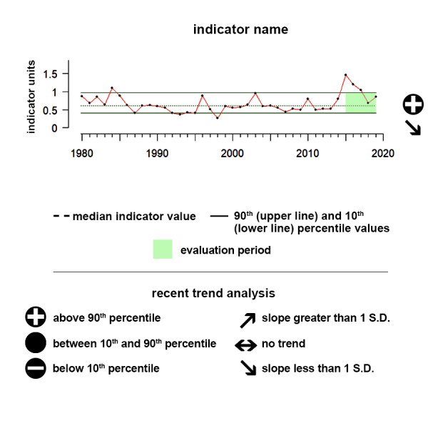
Understanding the Time series plots
Time series plots show the changes in each indicator as a function of time, over the period 1980-present. Each plot also shows horizontal lines that indicate the median (middle) value of that indicator, as well as the 10th and 90th percentiles, each calculated for the entire period of measurement. Time series plots were only developed for datasets with at least 10 years of data. Two symbols located to the right of each plot describe how recent values of an indicator compare against the overall series. A black circle indicates whether the indicator values over the last five years are on average above the series 90th percentile (plus sign), below the 10th percentile (minus sign), or between those two values (solid circle). Beneath that an arrow reflects the trend of the indicator over the last five years; an increase or decrease greater than one standard deviation is reflected in upward or downward arrows respectively, while a change of less than one standard deviation is recorded by a left-right arrow.

El Niño-Southern Oscillation (Oceanic Niño Index)
After an El Nino event that spanned much of 2023, conditions transitioned to ENSO neutral in the spring of 2024 and have remained neutral since then.
Values correspond to Index scores
Description of time series:
The Oceanic Niño Index (ONI) is NOAA’s primary index for monitoring the El Niño-Southern Oscillation climate pattern. It is based on Sea Surface Temperature values in a particular part of the central equatorial Pacific, which scientists refer to as the Niño 3.4 region. Positive values of this indicator, greater than +0.5, indicate warm El Niño conditions, while negative values, less than -0.5, indicate cold La Niña conditions. Values between +0.5 and -0.5 are considered ENSO neutral. The ONI shifted from La Nina conditions to neutral conditions in early 2023, and with continued sea-surface warming now indicate that an El Nino has begun.
Description of El Niño-Southern Oscillation (ENSO):
El Niño and La Niña are opposite phases of the El Niño-Southern Oscillation (ENSO), a cyclical condition occurring across the Equatorial Pacific Ocean with worldwide effects on weather and climate. During an El Niño, surface waters in the central and eastern equatorial Pacific become warmer than average and the trade winds - blowing from east to west - greatly weaken. During a La Niña, surface waters in the central and eastern equatorial Pacific become much cooler, and the trade winds become much stronger. El Niños and La Niñas generally last about 6 months but can extend up to 2 years. The time between events is irregular, but generally varies between 2-7 years. To monitor ENSO conditions, NOAA operates a network of buoys, which measure temperature, currents, and winds in the equatorial Pacific.
This climate pattern impacts people and ecosystems around the world by affecting large scale areas of tropical convection, and by extension, the jet streams. Interactions between the ocean and atmosphere alter weather globally and can result in severe storms or mild weather, drought or flooding. Beyond “just” influencing the weather and ocean conditions, these changes can produce secondary results that influence food supplies and prices, forest fires and flooding, and create additional economic and political consequences. For example, along the west coast of the U.S., warm El Niño events are known to inhibit the delivery of nutrients from subsurface waters, suppressing local fisheries. El Niño events are typically associated with fewer hurricanes in the Atlantic while La Niña events typically result in greater numbers of Atlantic hurricanes.
Data Background:
ENSO ONI data was accessed from NOAA’s Climate Prediction Center (https://origin.cpc.ncep.noaa.gov/products/analysis_monitoring/ensostuff/ONI_v5.php). The data are plotted in degrees Celsius and represent Sea Surface Temperature anomalies averaged across the so-called Niño 3.4 region in the east-central tropical Pacific between 120°-170°W and 5°S-5°N .
Multivariate El Niño-Southern Oscillation Index (MEI)
The MEI indicator shifted from neutral to negative in the spring of 2024 and has been indicating La Nina conditions since then.
Values correspond to Index scores
Description of time series:
Like the Oceanic Niño Index, positive MEI values indicate warm, El Niño conditions and negative MEI values indicate cold, La Niña conditions. The MEI indicator shifted from negative to positive during the summer of 2023, and has since shown El Nino conditions.
Description of Multivariate El Niño-Southern Oscillation Index:
The Multivariate El Niño-Southern Oscillation Index (MEI) is a more holistic representation of the atmospheric and oceanic conditions that occur during ENSO events and characterizes their intensity. MEI is determined from five variables from the central and eastern equatorial Pacific (Sea-level pressure, surface wind components, sea surface temperature,, and cloudiness), while ENSO ONI is only based on sea surface temperature. This index is calculated twelve times per year for each sliding bi-monthly season i.e. Dec-Jan, Jan-Feb, Feb-Mar, etc.
Data Background:
MEI data was accessed from NOAA’s Earth Systems Research Laboratory (https://psl.noaa.gov/enso/mei/). The data plotted are unitless anomalies.
Pacific Decadal Oscillation (PDO)
During the last five years, the PDO indicator has trended downward, shifting from positive phase to negative phase in 2019.
Values correspond to Index scores
Description of time series:
Positive PDO values typically mean cool surface water conditions in the interior of the North Pacific Ocean and warm surface waters along the North American Pacific Coast while negative PDO conditions typically mean warm surface water conditions in the interior to the North Pacific Ocean and cool surface waters along the North American Pacific Coast. During the last five years, the PDO indicator has trended downward, shifting from positive phase to negative phase in 2019.
Description of Pacific Decadal Oscillation (PDO):
The Pacific Decadal Oscillation (PDO) is a long-term pattern of Pacific climate variability that comprises multiple physical forcing mechanisms. The extreme phases of this climatic condition are classified as warm or cool, based on deviations from average ocean temperature in the northeast and central North Pacific Ocean. When the PDO has a positive value, sea surface temperatures are below average (cool) in the interior North Pacific and warm along the Pacific Coast. When the PDO has a negative value, the climate patterns are reversed, with above average sea surface temperatures in the interior and sea surface temperatures below average along the North American coast. On shorter timescales a positive (negative) PDO is often related to El Niño (La Niña). The PDO waxes and wanes on longer timescales as well; warm and cold phases may persist for decades. Major changes in northeast Pacific marine ecosystems have been correlated with phase changes in the PDO. Warm phases have seen enhanced coastal ocean biological productivity in Alaska and inhibited productivity off the west coast of the United States, while cold PDO phases have seen the opposite, north-south pattern of marine ecosystem productivity. We present data from the Pacific Islands, Alaska, and California Current regions
Data Background:
Climate indicator data was accessed from the NOAA NCEI (https://www.NCEI.noaa.gov/teleconnections/pdo/data.csv). The data plotted are unitless and based on Sea Surface Temperature anomalies averaged across a given region.
East Pacific - North Pacific Teleconnection Pattern Index
During the last five years, the EP-NP indicator has shifted from mostly positive to mostly negative.
Values correspond to Index scores
Description of time series:
Positive EP-NP values mean above-average surface temperatures over the eastern North Pacific, and below-average temperatures over the central North Pacific and eastern North America and the opposite for negative EP-NP values. During the last five years, the EP-NP indicator has shifted from mostly positive to mostly negative.
Description of East Pacific/ North Pacific Teleconnection Pattern Index:
The East Pacific/ North Pacific Teleconnection Pattern Index is a measure of climate variability. Positive EP-NP values mean above-average surface temperatures over the eastern North Pacific, and below-average temperatures over the central North Pacific and eastern North America and the opposite for negative EP-NP values.
This climate condition impacts people and ecosystems across the globe and each of the indicators presented here. Interactions between the ocean and atmosphere alter weather around the world and can result in severe storms or mild weather, drought, or flooding. Beyond “just” influencing the weather and ocean conditions, these changes can produce secondary results that influence food supplies and prices, forest fires and flooding, and create additional economic and political consequences. The positive phase of the EP-NP pattern is associated with above-average surface temperatures over the eastern North Pacific, and below-average temperatures over the central North Pacific and eastern North America. The main precipitation anomalies associated with this pattern reflect above-average precipitation in the area north of Hawaii and below-average precipitation over southwestern Canada
Data Background:
Climate indicator data was accessed from NOAA NCEP (https://ftp.cpc.ncep.noaa.gov/wd52dg/data/indices/epnp_index.tim). The data plotted are unitless anomalies.
North Atlantic Oscillation (NAO)
During the last five years, the NAO indicator shows no significant trend but has remained largely in the negative phase.
Values correspond to Index scores
Description of time series:
Positive NAO values mean significantly warmer winters over much of the eastern U.S. and northern Europe and negative NAO values can mean cold winter outbreaks and heavy snowstorms. During the last five years, the NAO indicator shows no significant trend but has remained largely in the negative phase.
Description of North Atlantic Oscillation (NAO):
The North Atlantic Oscillation (NAO) Index measures the relative strengths and positions of a permanent low-pressure system over Iceland (the Icelandic Low) and a permanent high-pressure system over the Azores (the Azores High). When the index is positive (NAO+) significantly warmer winters can occur over much of the eastern U.S. This prevents nutrient-rich upwelling, which reduces productivity. When the NAO index is negative, the upper central and eastern portions of the United States can incur winter cold outbreaks and heavy snowstorms. This climate condition impacts people and ecosystems across the globe and each of the indicators presented here. Interactions between the ocean and atmosphere alter weather around the world and can result in severe storms or mild weather, drought, or flooding. Beyond “just” influencing the weather and ocean conditions, these changes can produce secondary results that influence food supplies and prices, forest fires and flooding, and create additional economic and political consequences.
Data:
Climate indicator data was accessed from the NOAA NCEI (https://www.NCEI.noaa.gov/teleconnections/nao). The data plotted are unitless anomalies and averaged across a given region.
Atlantic Multidecadal Oscillation
During the last five years, the AMO has largely been in a positive phase, and continues to trend upward.
Values correspond to Index scores
Description of time series:
Positive AMO values indicate the warm phase, during which surface waters in the North Atlantic Ocean are warmer than average, and negative AMO values indicate the cold phase, during which surface waters in the North Atlantic Ocean are cooler than average. During the last five years, the AMO has largely been in a positive phase, and continues to trend upward.
Description of Atlantic Multidecadal Oscillation (AMO):
The Atlantic Multidecadal Oscillation is a series of long-duration changes in the North Atlantic sea surface temperature, with cool and warm phases that may last for 20-40 years. Most of the Atlantic between the equator and Greenland changes in unison. Some areas of the North Pacific also seem to be affected. This broadscale climate condition affects air temperatures and rainfall over much of the Northern Hemisphere. It is also related to major droughts in the Midwest and the Southwest of the U.S. In the warm phase, these droughts tend to be more frequent and/or severe. Vice-versa for the cold phase. During the warm phases the number of tropical storms that mature into severe hurricanes is much greater than during cool phases. Despite the association of AMO with multiple weather and climate impacts, recent scientific debate has questioned whether this indicator is a natural climate variation, like the other climate indicators presented here, or a response of the climate system to human-caused climate change. Whether natural or a result of human-caused climate change, AMO is a useful feature for tracking large-scale weather and climate events. This climate condition impacts people and ecosystems across the globe and each of the indicators presented here. Interactions between the ocean and atmosphere alter weather around the world and can result in severe storms or mild weather, drought, or flooding. Beyond “just” influencing the weather and ocean conditions, these changes can produce secondary results that influence food supplies and prices, forest fires and flooding, and create additional economic and political consequences
Data Background:
Climate indicator data was accessed from NOAA’s Earth Systems Research Laboratory (https://www.esrl.noaa.gov/psd/data/timeseries/AMO/). The data plotted are unitless anomalies and averaged across a given region
National SST
During the last five years there has been no notable trend and values were between the 10th and 90th percentile of all observed data in the time series.
Sea surface temperature is defined as the average temperature of the top few millimeters of the ocean. Sea surface temperature monitoring tells us how the ocean and atmosphere interact, as well as providing fundamental data on the global climate system
Data Interpretation:
Time series: The time series shows the integrated sea surface temperature across the US. During the last five years there has been no notable trend and values were between the 10th and 90th percentile of all observed data in the time series.
Description of Sea Surface Temperature:
Sea surface temperature (SST) is defined as the temperature of the top few millimeters of the ocean. This temperature directly or indirectly impacts the rate of all physical, chemical, and most biological processes occurring in the ocean. SST is globally monitored by sensors on satellites, buoys, ships, ocean reference stations, autonomous underwater vehicles (AUVs) and other technologies.
SST monitoring tells us how the ocean and atmosphere interact, as well as providing fundamental data on the global climate system. This information also aids us in weather prediction, i.e. identifying the onset of El Niño and La Niña cycles - multiyear shifts in atmospheric pressure and wind speeds. These shifts affect ocean circulation, global weather patterns, and marine ecosystems. SST anomalies have been linked to shifting marine resources. With warming temperatures, we observe the poleward movements of fish and other species. Temperature extremes—both ocean heatwaves and cold spells—have been linked to coral bleaching as well as fishery and aquaculture mortality. We present the annual average SST in all regions.
Data:
The SST product used for this analysis is the NOAA Coral Reef Watch CoralTemp v3.1 SST composited monthly (https://coralreefwatch.noaa.gov/product/5km/index_5km_sst.php) accessed from CoastWatch (https://oceanwatch.pifsc.noaa.gov/erddap/griddap/CRW_sst_v3_1_monthly.g…) . Great Lakes SST data were accessed from (https://coastwatch.glerl.noaa.gov/glsea/glsea.html).
The data are plotted in degrees Celsius.
Data background and limitations:
The NOAA Coral Reef Watch (CRW) daily global 5km Sea Surface Temperature (SST) product, also known as CoralTemp, shows the nighttime ocean temperature measured at the surface. The CoralTemp SST data product was developed from two, related reanalysis (reprocessed) SST products and a near real-time SST product. Monthly composites were used for this analysis
National Sea Level
During the last five years, values are above the 90th percentile but there has been no trend.
Sea level varies due to the force of gravity, the Earth’s rotation and irregular features on the ocean floor. Other forces affecting sea levels include temperature, wind, ocean currents, tides, and other similar processes.
Description of time series:
The time series shows the relative sea level across the United States. During the last five years, values are above the 90th percentile but there has been no trend.
Description of Sea Level:
Sea level varies due to the force of gravity, the Earth’s rotation and irregular features on the ocean floor. Other forces affecting sea levels include temperature, wind, ocean currents, tides, and other similar processes. With 40 percent of Americans living in densely populated coastal areas, having a clear understanding of sea level trends is critical to societal and economic well being.
Measuring and predicting sea levels, tides and storm surge are important for determining coastal boundaries, ensuring safe shipping, emergency preparedness, and other aspects of the well-being of coastal communities.
Indicator and source information:
Global sea level has been rising over the past century, with increasing rates in recent decades driven primarily by warming of the ocean (since water expands as it warms) and by increased melting of land-based ice, such as glaciers and ice sheets. Local and regional sea-level change may be more or less than the global average due to local factors such as land subsidence, changes in regional ocean currents, and whether the land is still rebounding from the compressive weight of Ice Age glaciers.
With 40 percent of Americans living in densely populated coastal areas, having a clear understanding of sea level trends is critical to societal and economic well being. Measuring and predicting sea levels, tides and storm surge are important for determining coastal boundaries, ensuring safe shipping, and emergency preparedness, etc. NOAA monitors sea levels using tide stations and satellite laser altimeters. Tide stations around the globe tell us what is happening at local levels, while satellite measurements provide us with the average height of the entire ocean. Taken together, data from these sources are fed into models that tell us how our ocean sea levels are changing over time. For this site, data from tide stations around the US were combined to create regionally averaged records of sea-level change since 1980. We present data for all regions.
Data background and limitations:
Source: http://www.cmar.csiro.au/sealevel/sl_data_cmar.html These data are measurements of global tide-gauge and satellite data that have been combined statistically to create a picture of global relative sea level (see Church, J. A. and N.J. White (2011), Sea-level rise from the late 19th to the early 21st Century. Surveys in Geophysics, doi:10.1007/s10712-011-9119-1 for methods). Data are in centimeters relative to the year 1880.
Alaska Arctic Ice
During the last five years, there has been no notable trend and values are within the 10th and 90th percentiles, albeit near the lower end of the time series.
Sea ice is an important element of the Arctic system. We present the annual Arctic sea ice extent in units of millions of square kilometers.
Data Interpretation:
This time series shows the sea ice extent for the Alaska-Arctic region from 1979 to 2024. During the last five years, there has been no notable trend and values are within the 10th and 90th percentiles, albeit near the lower end of the time series.
Indicator and source information:
Sea ice is ice that forms, expands, and melts in the ocean. Sea ice has an important effect on Earth’s heat balance by reflecting solar energy back to space; it also plays a role in determining ocean salinity and currents, and it provides important habitat for many marine organisms.
The time series shows the Sea Ice extent in September of each year to give a sense of the summertime (i.e., minimum annual) extent through the years of sea ice across the entire Northern Hemisphere, which includes the Arctic Ocean and the Hudson Bay.
Data background and limitations:
Sea ice figures and data was accessed from NOAA NCEI for the northern hemisphere, https://www.ncei.noaa.gov/access/monitoring/snow-and-ice-extent/ The data are plotted in units of millions of square km.
Close
National Chlorophyll-a
These data are not appropriate for status and trend calculation.
Chlorophyll a, a pigment produced by phytoplankton, can be measured to determine the amount of phytoplankton present in water bodies. From a human perspective, high values of chlorophyll a can be good (abundance of nutritious diatoms as food for fish) or bad (Harmful Algal Blooms that may cause respiratory distress for people), based on the associated phytoplankton species.
Data Interpretation:
Time series: This time series shows the average concentration of chlorophyll a across all U.S. LMEs. These data are not appropriate for status and trend calculation.
Description of Chlorophyll a:
Phytoplankton are microscopic plants at the base of most marine food webs and produce nearly half of the Earth’s oxygen. One way we estimate the number of phytoplankton in the ocean is by measuring the amount of chlorophyll a in the water. Chlorophyll a is a green pigment (the same pigment that makes tree leaves appear green) that the phytoplankton use to absorb sunlight. The amount (or concentration) of chlorophyll a in surface waters can be calculated by measuring the color of the water (also referred to as “ocean color”). Satellite sensors measure water color, similar to how your eyes see the color of the ocean. Blue water has low chlorophyll, while green waters have high chlorophyll. Environmental and oceanographic factors continuously influence the abundance, species composition, spatial distribution, and productivity of phytoplankton. Tracking the amount of phytoplankton in the ocean conveys how much food is available at the base of the food web for other animals. Changes in the amount of phytoplankton in the ocean are part of the natural seasonal cycle (similar to seasonal changes of plants on land), but can also indicate an ecosystem’s response to a major external disturbance such as a hurricane or typhoon.
Data Source:
Chlorophyll-a concentration values for this indicator were obtained using data from the European Spatial Agency (ESA) that is a validated, error-characterized, Essential Climate Variable (ECV) and climate data record (CDR) from satellite observations specifically developed for climate studies. The dataset (v6.0) is created by bandshifting the reflectances values from SeaWiFS, MODIS and VIIRS to MERIS wavebands if necessary, and SeaWiFS and MODIS were corrected for inter-sensor bias when compared with MERIS in the 2003-2007 period. VIIRS and OLCI were also corrected to MERIS levels, via a two-stage process comparing against the MODIS-corrected-to-MERIS-levels (2012-2013 for VIIRS and 2016-2019 for OLCI).
Source: https://climate.esa.int/en/projects/ocean-colour/key-documents/
National Zooplankton Biomass
Between 2016 and 2021 the national average concentration of zooplankton biomass showed a significant decreasing trend but was similar to historical values.
Description of time series:
Between 2016 and 2021 the national average concentration of zooplankton biomass showed a significant decreasing trend but was similar to historical values.
Description of Zooplankton:
Zooplankton are a diverse group of animals found in oceans, bays, and estuaries. By eating phytoplankton, and each other, zooplankton play a significant role in the transfer of materials and energy up the oceanic food web (e.g., fish, birds, marine mammals, humans.) Like phytoplankton, environmental and oceanographic factors continuously influence the abundance, composition and spatial distribution of zooplankton. These include the abundance and type of phytoplankton present in the water, as well as the water’s temperature, salinity, oxygen, and pH. Zooplankton can rapidly react to changes in their environment. For this reason monitoring the status of zooplankton is essential for detecting changes in, and evaluating the status of ocean ecosystems. We present the annual average total biovolume of zooplankton in the Alaska, California Current, Gulf of Mexico, Hawai'i-Pacific Islands and Northeast regions.
Data Background and Caveats:
Unlike previous years, all value are now standardized to "ml/m3". For example, EcoMon data units went from "ml/100m3" to just "ml/m3", but that did not affect the shape of the trends as it is a linear multiplicative factor. CalCOFI, however, went from "ml/m2" to "ml/m3", and the trend has changed noticeably. It is now noisier and no clear trend. One converts "ml/m2" to "ml/m3" by dividing by the towing depth (m). That is a non-linear muplicative factor, so it can affect each data point and change the data shape.
HI -Note that Hawai’i is Wet Mass (g/m3) , not DV (ml/m3).
Finally, a log10 value frequency histogram of the raw data values showed that 99.9% of the DV data values were less than 15 ml/m3. To reduce the impact of large outliers (i.e., due to a large jellyfish or an algal mat caught in the net), any DV value greater than 15 was capped at a value of just 15. Again, this would only affect < 0.1% of the data. In some extreme cases, original DV values were over 100+ ... which greatly skewed the means and trends if not removed. This is actually standard practice. CalCOFI offers both a "large" and "small" DV value (with the latter having large values removed), for example, and some programs automatically remove any plankter larger than the 5 cm length from the net sample before measuring the DV.
Zooplankton data for each region were obtained from the NOAA Fisheries Coastal & Oceanic Plankton Ecology, Production, & Observations Database, an integrated data set of quality-controlled, globally distributed plankton biomass and abundance data with common biomass units and served in a common electronic format with supporting documentation and access software. Source: https://www.st.nmfs.noaa.gov/copepod/about/about-copepod.html
National Overfished Stocks
Between 2018 and 2023 the number of overfished stocks shows no trend.
The x-axis represents years. The y-axis represents the number of fish stocks or fish populations that are deemed by NOAA as overfished. Overfished means the population of fish is too low. Therefore the population can not support a large amount of fishing.
Description of time series:
The series shows the number of fish populations that have been listed as overfished since 2000. Between 2018 and 2023 the number of overfished stocks shows no trend.
An overfished stock is a population of fish that is too low. A stock that is experiencing overfishing has an annual rate of catch that is too high. Therefore the population cannot support that level of fishing and is below that level is deemed “overfished.” A fish population can be “overfished” as the result of many factors, including overfishing, as well as habitat degradation, pollution, climate change, and disease. The Magnuson-Stevens Act mandates that overfished stocks and stocks experiencing overfishing be reported annually. Stock status is determined by NOAA, based on the results of stock assessments.
To understand the abundance and distribution of fish populations, NOAA regularly assesses fish stocks through stock assessments. Stock assessments provide the information necessary for NOAA to make determinations that a stock is experiencing overfishing (harvest higher than a maximum sustainable yield) or is overfished (population size is too low such that it jeopardizes supporting the maximum sustainable yield). If a stock becomes overfished, stock assessments can help determine what steps may be taken to rebuild it to sustainable levels, including the appropriate reduction in fishing rates.
It is important to track whether a fish population is overfished or experiencing overfishing because fish play an important role in marine ecosystems. Fish support the ecological structure of many marine food webs. Caught by recreational and commercial fisheries, fish support significant parts of coastal economies, and can play an important cultural role in many regions.
This site presents the number of overfished stocks by year in all regions.
Data Source:
Data were obtained from the NOAA Fisheries Fishery Stock Status website. Stocks that met the criteria for overfished status were summed by year for each region.
National ESA
Trend and gauge analysis was not appropriate for Endangered Species Act (ESA) threatened or endangered marine mammals data.
Description of time series and gauge:
Trend and gauge analysis was not appropriate for Endangered Species Act (ESA) threatened or endangered marine mammals data.
Description of Threatened and Endangered Marine Mammals (ESA):
NOAA Fisheries is responsible for the protection, conservation, and recovery of endangered and threatened marine and anadromous species under the Endangered Species Act (ESA). The ESA aims to conserve these species and the ecosystems they depend on. Under the ESA, a species is considered endangered if it is in danger of extinction throughout all or a significant portion of its range, or threatened if it is likely to become endangered in the foreseeable future throughout all or a significant portion of its range See a species directory of all the threatened and endangered marine species under NOAA Fisheries jurisdiction, including marine mammals.
Under the ESA, a species must be listed if it is threatened or endangered because of any of the following 5 factors:
1) Present or threatened destruction, modification, or curtailment of its habitat or range;
2) Over-utilization of the species for commercial, recreational, scientific, or educational purposes;
3) Disease or predation;
4) Inadequacy of existing regulatory mechanisms; and
5) Other natural or manmade factors affecting its continued existence.
The ESA requires that listing determinations be based solely on the best scientific and commercial information available; economic impacts are not considered in making species listing determinations and are prohibited under the ESA. There are two ways by which a species may come to be listed (or delisted) under the ESA:
- NOAA Fisheries receives a petition from a person or organization requesting that NOAA lists a species as threatened or endangered, reclassify a species, or delist a species.
- NOAA Fisheries voluntarily chooses to examine the status of a species by initiating a status review of a species.
Data:
Summary data tables from the NOAA Fisheries Protected Resources Species Information System were obtained from the database manager. The number of ESA threatened and endangered species were summed for each region by year.
National MMPA
Trend analyses are not appropriate for Marine Mammal Protection Act (MMPA) strategic/depleted species data.
Description of time series:
Trend and gauge analysis are not appropriate for Marine Mammal Protection Act (MMPA) strategic/depleted species data.
Data:
Data methods Summary data tables from the NOAA Fisheries Protected Resources Species Information System were obtained from the database manager. The number of MMPA strategic and depleted stock species were summed for each region by year.
Description of Marine Mammal Strategic and Depleted Stocks (MMPA):
A stock is defined by the Marine Mammal Protection Act (MMPA), as a group of marine mammals of the same species or smaller taxa in a common spatial arrangement, that interbreed when mature. See a list of the marine mammal stocks NOAA protects under the MMPA.
A strategic stock is defined by the MMPA as a marine mammal stock—
- For which the level of direct human-caused mortality exceeds the potential biological removal level or PBR (defined by the MMPA as the maximum number of animals, not including natural mortalities, that may be removed from a marine mammal stock while allowing that stock to reach or maintain its optimum sustainable population);
- Which, based on the best available scientific information, is declining and is likely to be listed as a threatened species under the Endangered Species Act (ESA) within the foreseeable future; or
- Which is listed as a threatened or endangered species under the ESA, or is designated as depleted under the MMPA.
A depleted stock is defined by the MMPA as any case in which—
- The Secretary of Commerce, after consultation with the Marine Mammal Commission and the Committee of Scientific Advisors on Marine Mammals established under MMPA title II, determines that a species or population stock is below its optimum sustainable population;
- A State, to which authority for the conservation and management of a species or population stock is transferred under section 109, determines that such species or stock is below its optimum sustainable population; or
- A species or population stock is listed as an endangered species or a threatened species under the ESA.
Close
National Coastal Population
The 2017 – 2022 national average coastal population was substantially above historic levels, although the recent trend is not different from historical trends.
Values correspond to the total coastal population in a given region.
Time Series
The 2017 – 2022 national average coastal population was substantially above historic levels, although the recent trend is not different from historical trends.
Indicator Source Information:
The American Community Survey (ACS) helps local officials, community leaders, and businesses understand the changes taking place in their communities. It is the premier source for detailed population and housing information about our nation.
Data Background and Caveats:
The values represented here are coastal county population estimates for states bordering US Large Marine Ecosystems as calculated by the US Census Bureau from the American Community Survey
National Coastal Tourism GDP
Between 2016 and 2021 the average change in coastal county tourism GDP showed no trend.
Values correspond to percent change in the GDP of the Tourism Sector of Coastal Counties in US States that border a region
Description of Time Series: Between 2016 and 2021 the average change in coastal county tourism GDP showed no trend.
Description of Coastal Tourism:
U.S. coasts are host to a multitude of travel, tourism, and recreation activities. To manage our coasts, plan for development, and assess impacts as a result of coastal hazards including sea level rise, it is important to have baseline economic information. To accomplish this, we need indicators of the economic value of recreation and tourism. We present the annual total change in billions of dollars of goods and services (GDP), employment and annual wages provided from tourism industries in the Gulf of Mexico, Mid-Atlantic, Northeast, Hawaii-Pacific Islands, Southeast, and California Current regions. This data does not include industries located in U.S. territories.
Indicator Information:
Coastal tourism Gross Domestic Product is the total measure (in billions of 2012 dollars) of goods and services provided from various industries involved in tourism services and products along the coast. Data for Coastal Counties come from the US Census Bureau. This dataset represents US counties and independent cities which have at least one coastal border and select non-coastal counties and independent cities based on proximity to estuaries and other coastal counties. The dataset is built to support coastal and ocean planning and other activities pursuant to the Energy Policy Act, Coastal Zone Management Act, Magnuson-Stevens Fishery Conservation and Management Act, National Environmental Policy Act, Rivers and Harbors Act and the Submerged Lands Act.
The figures reported here lag three years and come from the most recently available data sets issued by the Bureau of Labor Statistics, the Bureau of Economic Analysis and the Census Bureau. The onset of the COVID-19 pandemic in 2020 coincided with significant declines in marine economy employment and output, particularly in the tourism and recreation sector. The overall U.S. economy returned to growth in 2021 and 2022, but marine economy data are not yet available for those years, nor in this year’s report. Subsequent years of data will shed light the U.S. marine economy’s response to and recovery from pandemic-related disruptions.
Data Source:
Coastal Tourism GDP, employment, and real wage data was taken from NOAA’s Office of Coastal Management Economics: National Ocean Watch (ENOW) custom report building tool, with contextual data taken from the 2020 NOAA Report on the U.S. Marine Economy: Regional and State Profiles. Growth was estimated by subtracting the previous year’s value from the current year’s value, then dividing by the previous year’s value to present a percentage. All data was deflated to 2012 constant dollars using the Bureau of Economic Analysis’ chained dollar methodology.
National Coastal Tourism Employment
Between 2016 and 2021 the average change in coastal county employment showed no trend but was below historic norms.
Values correspond to percent change in the Employment in the Tourism Sector of Coastal Counties in US States that border a region
Description of Time Series: Between 2016 and 2021 the average change in coastal county employment showed no trend but was below historic norms.
Description of Coastal Tourism:
U.S. coasts are host to a multitude of travel, tourism, and recreation activities. To manage our coasts, plan for development, and assess impacts as a result of coastal hazards including sea level rise, it is important to have baseline economic information. To accomplish this, we need indicators of the economic value of recreation and tourism. We present the annual total change in billions of dollars of goods and services (GDP), employment and annual wages provided from tourism industries in the Gulf of Mexico, Mid-Atlantic, Northeast, Hawaii-Pacific Islands, Southeast, and California Current regions. This data does not include industries located in U.S. territories.
Indicator Source Information:
Coastal tourism employment is the total measure of jobs in tourism industries along the coast. Data for Coastal Counties come from the US Census Bureau. This dataset represents US counties and independent cities which have at least one coastal border and select non-coastal counties and independent cities based on proximity to estuaries and other coastal counties. The dataset is built to support coastal and ocean planning and other activities pursuant to the Energy Policy Act, Coastal Zone Management Act, Magnuson-Stevens Fishery Conservation and Management Act, National Environmental Policy Act, Rivers and Harbors Act and the Submerged Lands Act.
The figures reported here lag three years and come from the most recently available data sets issued by the Bureau of Labor Statistics, the Bureau of Economic Analysis and the Census Bureau. The onset of the COVID-19 pandemic in 2020 coincided with significant declines in marine economy employment and output, particularly in the tourism and recreation sector. The overall U.S. economy returned to growth in 2021 and 2022, but marine economy data are not yet available for those years, nor in this year’s report. Subsequent years of data will shed light the U.S. marine economy’s response to and recovery from pandemic-related disruptions.
Data Source:
Coastal Tourism GDP, employment, and real wage data was taken from NOAA’s Office of Coastal Management Economics: National Ocean Watch (ENOW) custom report building tool, with contextual data taken from the 2020 NOAA Report on the U.S. Marine Economy: Regional and State Profiles. Growth was estimated by subtracting the previous year’s value from the current year’s value, then dividing by the previous year’s value to present a percentage. All data was deflated to 2012 constant dollars using the Bureau of Economic Analysis’ chained dollar methodology.
National Tourism Wage
Between 2016 and 2021 the average coastal county real wage compensation showed no trend.
Values correspond to total Real Wage Compensation the Tourism Sector of Coastal Counties in US States that border a region
Description of Time Series: Between 2016 and 2021 the average coastal county real wage compensation showed no trend.
Description of Coastal Tourism:
U.S. coasts are host to a multitude of travel, tourism, and recreation activities. To manage our coasts, plan for development, and assess impacts as a result of coastal hazards including sea level rise, it is important to have baseline economic information. To accomplish this, we need indicators of the economic value of recreation and tourism. We present the annual total change in billions of dollars of goods and services (GDP), employment and annual wages provided from tourism industries in the Gulf of Mexico, Mid-Atlantic, Northeast, Hawaii-Pacific Islands, Southeast, and California Current regions. This data does not include industries located in U.S. territories.
Indicator Source Information:
Coastal tourism wage is the measure of wages (nominal) paid to employees in tourism industries along the coast. Data for Coastal Counties come from the US Census Bureau. This dataset represents US counties and independent cities which have at least one coastal border and select non-coastal counties and independent cities based on proximity to estuaries and other coastal counties. The dataset is built to support coastal and ocean planning and other activities pursuant to the Energy Policy Act, Coastal Zone Management Act, Magnuson-Stevens Fishery Conservation and Management Act, National Environmental Policy Act, Rivers and Harbors Act and the Submerged Lands Act
The figures reported here lag three years and come from the most recently available data sets issued by the Bureau of Labor Statistics, the Bureau of Economic Analysis and the Census Bureau. The onset of the COVID-19 pandemic in 2020 coincided with significant declines in marine economy employment and output, particularly in the tourism and recreation sector. The overall U.S. economy returned to growth in 2021 and 2022, but marine economy data are not yet available for those years, nor in this year’s report. Subsequent years of data will shed light the U.S. marine economy’s response to and recovery from pandemic-related disruptions.
Data Source:
Coastal Tourism GDP, employment, and real wage data was taken from NOAA’s Office of Coastal Management Economics: National Ocean Watch (ENOW) custom report building tool, with contextual data taken from the 2020 NOAA Report on the U.S. Marine Economy: Regional and State Profiles. Growth was estimated by subtracting the previous year’s value from the current year’s value, then dividing by the previous year’s value to present a percentage. All data was deflated to 2012 constant dollars using the Bureau of Economic Analysis’ chained dollar methodology.
National Total Coastal Employment
Across the nation, average coastal employment between 2017 and 2021 was similar to historical levels, and a decreasing trend is apparent over that same period.
Values correspond to total employment in all industries in a given coastal region
Time Series
Across the nation, average coastal employment between 2017 and 2021 was similar to historical levels, and a decreasing trend is apparent over that same period.
Description of coastal employment:
The total coastal employment is the number of jobs in coastal communities. Businesses in coastal counties employ tens of millions of people nationally. This includes hundreds of thousands of ocean-dependent businesses that pay over $100 billion in wages annually. Many coastal and ocean amenities attracting visitors are free, generating no direct employment, wages, or gross domestic product. However, these “nonmarket” features are key drivers for many coastal businesses. We present data for all regions.
Data Source:
Coastal employment numbers were downloaded from the NOAA ENOW Explorer Tool, filtered to present only coastal county values using the Census Bureau’s list of coastal counties within each state. ENOW Explorer streamlines the task of obtaining and comparing economic data, both county and state, for the six sectors dependent on the ocean and Great Lakes: living resources, marine construction, marine transportation, offshore mineral resources, ship and boat building, and tourism and recreation. Data are derived from Economics: National Ocean Watch (ENOW), available on NOAA’s Digital Coast. Of note is that these data fail to include self-employed individuals. Coastal county employment numbers were then summed within each region for reporting purposes.
National Commercial Landings
Between 2017 and 2022, commercial landings were similar to historic levels nationally, and there is no recent trend apparent.
Values correspond to landings in millions of metric tons
Commercial Landings Time Series
Between 2017 and 2022, commercial landings were similar to historic levels nationally, and there is no recent trend apparent.
Description of Commercial Fishing (Landings and Revenue):
Commercial landings are the weight of, or revenue from, fish that are caught, brought to shore, processed, and sold for profit. It does not include sport or subsistence (to feed themselves) fishermen or for-hire sector, which earns its revenue from selling recreational fishing trips to saltwater anglers.
Commercial landings make up a major part of coastal economies. U.S. commercial fisheries are among the world’s largest and most sustainable; producing seafood, fish meal, vitamin supplements, and a host of other products for both domestic and international consumers.
The weight (tonnage), and revenue from the sale of commercial landings provides data on the ability of marine ecosystems to continue to supply these important products.
Indicator Source Information:
Landings are reported in pounds of round (live) weight for all species or groups except univalve and bivalve mollusks, such as clams, mussels, oysters and scallops, which are reported as pounds of meats (excludes shell weight). Landings data may sometimes differ from state-reported landings due to our reporting of mollusks in meat weights rather than gallons, shell weight, or bushels. Also, NMFS includes some species such as kelp and oysters that are sometimes reported by state agricultural agencies and may not be included with state fishery agency landings data.
Data Background and Caveats:
All landings summaries will return only non confidential landing statistics. Federal statutes prohibit public disclosure of landings (or other information) that would allow identification of the data contributors and possibly put them at a competitive disadvantage. Most summarized landings are non confidential, but whenever confidential landings occur they have been combined with other landings and usually reported as "Withheld for Confidentiality" Total landings by state include confidential data and will be accurate, but landings reported by individual species may, in some instances, be misleading due to data confidentiality.
Landings data do not indicate the physical location of harvest but the location at which the landings either first crossed the dock or were reported from.
Many fishery products are gutted or otherwise processed while at sea and are landed in a product type other than round (whole) weight. Our data partners have standard conversion factors for the majority of the commonly caught species that convert their landing weights from any product type to whole weight. It is the whole weight that is displayed in our web site landing statistics. Caution should be exercised when using these statistics. An example of a potential problem is when landings statistics are used to monitor fishery quotas. In some situations, specific conversion factors may have been designated in fishery management plans or Federal rule making that differ from those historically used by NOAA Fisheries in reporting landings statistics.
The dollar value of the landings are ex-vessel (as paid to the fisherman at time of first sale) and are reported as nominal (current at the time of reporting) values. Users can use the Consumer Price Index (CPI) or the Producer Price Index (PPI) to convert these nominal landing values into real (deflated) values.
Landings do not include aquaculture products except for clams, mussels and oysters.
Pacific landings summarized by state include an artificial “state” designation of “At-Sea Process, Pac.” This designation was assigned to landings consisting of primarily whiting caught in the EEZ off Washington and Oregon that were processed aboard large vessels while at sea. No Pacific state lists these fish on their trip tickets which are used to report state fishery landing, hence the at-sea processor designation was used to insure that they would be listed as a U.S. landing.
Landing summaries are compiled from data bases that overlap in time and geographic coverage, and come from both within and outside of NOAA Fisheries.
National Commercial Fishing Revenue
Between 2017 and 2022, national average annual commercial revenue was not different than historical patterns, although there is a decreasing trend in values.
Values correspond to revenue in 2022 US Dollars
Commercial Revenue Time Series
Between 2017 and 2022, national average annual commercial revenue was not different than historical patterns, although there is a decreasing trend in values.
Description of Commercial Fishing (Landings and Revenue):
Commercial landings are the weight of, or revenue from, fish that are caught, brought to shore, processed, and sold for profit. It does not include sport or subsistence (to feed themselves) fishermen or for-hire sector, which earns its revenue from selling recreational fishing trips to saltwater anglers.
Commercial landings make up a major part of coastal economies. U.S. commercial fisheries are among the world’s largest and most sustainable; producing seafood, fish meal, vitamin supplements, and a host of other products for both domestic and international consumers.
The weight (tonnage), and revenue from the sale of commercial landings provides data on the ability of marine ecosystems to continue to supply these important products.
Indicator Source Information:
Landings are reported in pounds of round (live) weight for all species or groups except univalve and bivalve mollusks, such as clams, mussels, oysters and scallops, which are reported as pounds of meats (excludes shell weight). Landings data may sometimes differ from state-reported landings due to our reporting of mollusks in meat weights rather than gallons, shell weight, or bushels. Also, NMFS includes some species such as kelp and oysters that are sometimes reported by state agricultural agencies and may not be included with state fishery agency landings data.
Data Background and Caveats:
All landings summaries will return only non confidential landing statistics. Federal statutes prohibit public disclosure of landings (or other information) that would allow identification of the data contributors and possibly put them at a competitive disadvantage. Most summarized landings are non confidential, but whenever confidential landings occur they have been combined with other landings and usually reported as "Withheld for Confidentiality" Total landings by state include confidential data and will be accurate, but landings reported by individual species may, in some instances, be misleading due to data confidentiality.
Landings data do not indicate the physical location of harvest but the location at which the landings either first crossed the dock or were reported from.
Many fishery products are gutted or otherwise processed while at sea and are landed in a product type other than round (whole) weight. Our data partners have standard conversion factors for the majority of the commonly caught species that convert their landing weights from any product type to whole weight. It is the whole weight that is displayed in our web site landing statistics. Caution should be exercised when using these statistics. An example of a potential problem is when landings statistics are used to monitor fishery quotas. In some situations, specific conversion factors may have been designated in fishery management plans or Federal rule making that differ from those historically used by NOAA Fisheries in reporting landings statistics.
The dollar value of the landings are ex-vessel (as paid to the fisherman at time of first sale) and are reported as nominal (current at the time of reporting) values. Users can use the Consumer Price Index (CPI) or the Producer Price Index (PPI) to convert these nominal landing values into real (deflated) values.
Landings do not include aquaculture products except for clams, mussels and oysters.
Pacific landings summarized by state include an artificial “state” designation of “At-Sea Process, Pac.” This designation was assigned to landings consisting of primarily whiting caught in the EEZ off Washington and Oregon that were processed aboard large vessels while at sea. No Pacific state lists these fish on their trip tickets which are used to report state fishery landing, hence the at-sea processor designation was used to insure that they would be listed as a U.S. landing.
Landing summaries are compiled from data bases that overlap in time and geographic coverage, and come from both within and outside of NOAA Fisheries.
National Recreational Effort
Between 2016 and 2020, recreational fishing effort in the US is around historic levels and shows no trend.
Values correspond to total angler trips
Description of time series:
Between 2016 and 2020, recreational fishing effort in the US is around historic levels and shows no trend.
Extreme Gauge values:
A value of zero on the gauge means that the average effort or harvest over the last 5 years of data was below any annual value up until that point, while a value of 100 would indicate the average value over that same period was above any annual value up until that point.
Description of Recreational Fishing (Effort and Harvest):
U.S. saltwater recreational fishing is an important source of seafood, jobs, and recreation for millions of anglers and for-hire recreational businesses. Recreational fishing effort is measured as “Angler Trips”, which is the number of recreational fishing trips people go on. Recreational fishing harvest is the number of fish caught and brought to shore on recreational fishing trips.
Recreational effort and harvest help us understand how recreational opportunities and seafood derived from our marine environment is changing over time. Fisheries managers use this data to set annual catch limits and fishing regulations, including season lengths, size, and daily catch limits. We present the total number of fish harvested and angler trips annually for all marine fish in all regions.
Indicator Source Information
Recreational harvest and effort data pulled from National Summary Query. Units of data are in Effort in Angler Trips and Harvest in numbers of fish. The data from these queries is used by state, regional and federal fisheries scientists and managers to maintain healthy and sustainable fish stocks.
Data Background and Caveats:
To properly interpret this information, it is important to consider the following key points:
- When comparing harvest estimates across an extended time series, note differences in sampling coverage through the years. Some estimates may not be comparable over long time series.
Changes may occur between preliminary and final estimates and year to year, meaning that the data may change when updated. Please review the Limitations and other sections on the Using the Data page from the source for more information.
National Recreational Harvest
No status and trend available.
Values correspond to millions of fish caught
Description of time series:
No status and trend available.
Extreme Gauge values:
A value of zero on the gauge means that the average effort or harvest over the last 5 years of data was below any annual value up until that point, while a value of 100 would indicate the average value over that same period was above any annual value up until that point.
Description of Recreational Fishing (Effort and Harvest):
U.S. saltwater recreational fishing is an important source of seafood, jobs, and recreation for millions of anglers and for-hire recreational businesses. Recreational fishing effort is measured as “Angler Trips”, which is the number of recreational fishing trips people go on. Recreational fishing harvest is the number of fish caught and brought to shore on recreational fishing trips.
Recreational effort and harvest help us understand how recreational opportunities and seafood derived from our marine environment is changing over time. Fisheries managers use this data to set annual catch limits and fishing regulations, including season lengths, size, and daily catch limits. We present the total number of fish harvested and angler trips annually for all marine fish in all regions.
Indicator Source Information
Recreational harvest and effort data pulled from National Summary Query. Units of data are in Effort in Angler Trips and Harvest in numbers of fish. The data from these queries is used by state, regional and federal fisheries scientists and managers to maintain healthy and sustainable fish stocks.
Data Background and Caveats:
To properly interpret this information, it is important to consider the following key points:
- When comparing harvest estimates across an extended time series, note differences in sampling coverage through the years. Some estimates may not be comparable over long time series.
Changes may occur between preliminary and final estimates and year to year, meaning that the data may change when updated. Please review the Limitations and other sections on the Using the Data page from the source for more information.
National Commercial Fishing Engagement
Between 2015 and 2020 the percent of communities moderately or highly engaged in commercial fishing showed a downward trend, with 2020 near a series low level.
The x-axis on this time series represents years and the y-axis represents the percent of communities that are moderate to highly engaged in commercial fishing across the U.S. Commercial fishing engagement is measured by the number permits, fish dealers, and vessel landings across the U.S.
Description of time series:
This time series shows the percent of communities moderately or highly engaged in commercial fishing in the U.S. from 2009 to 2020. Between 2015 and 2020 the percent of communities moderately or highly engaged in commercial fishing showed a downward trend, with 2020 near a series low level.
Description of U.S. Commercial Fishing Engagement:
Commercial fishing engagement is measured by the presence of fishing activity in coastal communities. The commercial engagement index is measured through permits, fish dealers, and vessel landings. A high rank within these indicates more engagement in fisheries. For details on both data sources and indicator development, please see https://www.fisheries.noaa.gov/national/socioeconomics/social-indicator….
NOAA Monitors commercial fishing engagement to better understand the social and economic impacts of fishing policies and regulations on our nation’s vital fishing communities. This and other social indicators help assess a coastal community’s resilience. NOAA works with state and local partners to monitor these indicators. We present data from the Northeast, Southeast, Gulf of Mexico, California Current, Alaska, and Hawaiian Island regions.
Data Source:
Commercial fishing engagement data is from the National Marine Fisheries Service’s social indicator data portal:https://www.st.nmfs.noaa.gov/data-and-tools/social-indicators/ The percentage of all communities in each region classified as medium, medium high, or highly engaged is presented for both recreational and commercial fishing.
National Recreational Fishing Engagement
Between 2015 and 2020 the percent of communities moderately or highly engaged in recreational fishing showed a significant upward trend.
Caption: The x-axis on this time series represents years and the y-axis represents the percent of communities that are moderately to highly engaged in recreational fishing across the US.
Recreational Engagement Time Series
This time series shows the percent of communities moderately to highly engaged in recreational fishing in the US from 2009 to 2020. Between 2015 and 2020 the percent of communities moderately or highly engaged in recreational fishing showed a significant upward trend.
Indicator Source Information
- AK
- The Alaska recreational engagement index is measured using the number of charter and sportfishing guide businesses, and sportfishing and guide licenses.
- HI
- The Hawai'i recreational engagement index is measured using the number of trips for charter, private recreational, shore and all modes combined.
- GoM
- The Gulf of Mexico recreational engagement index is measured using shore, private vessel and for-hire vessel fishing activity estimates for western Florida to Mississippi. The index for Louisiana and Texas is measured using estimates for boat ramps, fishing piers, recreational vessels by homeport and recreational vessels by owner address.
- CB
- NA
- SE
- The Southeast recreational engagement index is measured using shore, private vessel and for-hire vessel fishing activity estimates.
- NE
- The Northeast recreational engagement indicator is measured using shore, private vessel and for-hire vessel fishing activity estimates.
Data Background and Caveats
The data for recreational engagement indicators varies by state. A high rank within these indicates more engagement in fisheries. For details on both data sources and indicator development, please see https://www.fisheries.noaa.gov/national/socioeconomics/social-indicator….
National Billion Dollar Disasters
The number of disasters over the past 5 years is substantially higher than historical levels of events, and there is an upward trend in the number of events.
Values correspond to the number of events in a given year
Time Series
Across the nation, the number of billion dollar disasters is variable over time, fluctuating between 0 and 21 disasters a year. The number of disasters over the past 5 years is substantially higher than historical levels of events, and there is an upward trend in the number of events.
Description of billion dollar disasters:
In the United States, the number of weather and climate-related disasters exceeding 1 billion dollars has been increasing since 1980. These events have significant impacts to coastal economies and communities. The Billion Dollar Disaster indicator provides information on the frequency and the total estimated costs of major weather and climate events that occur in the United States. This indicator compiles the annual number of weather and climate-related disasters across seven event types. We Present the total annual number of disaster events for all regions.
Data Background and Caveats:
Events are included if they are estimated to cause more than one billion U.S. dollars in direct losses. The cost estimates of these events are adjusted for inflation using the Consumer Price Index (CPI) and are based on costs documented in several Federal and private-sector databases.
Close
National Beach Closures
Across the United States during the last five years, there has been substantially more beach closures due to unsafe water quality though there is a decreasing trend.
Beach closures are the number of days when beach water quality is determined to be unsafe.
Data Interpretation:
This time series shows the average number of beach closure days across the United States from 2000 to 2023. Across the United States during the last five years, there has been substantially more beach closures due to unsafe water quality though there is a decreasing trend.
Indicator and source information:
Unsafe water quality may have significant impacts on human health, local economies, and the ecosystem. Beach water quality is determined by the concentration of bacteria in the water (either Enterococcus sp. or Escherichia coli).
The US Environmental Protection Agency (EPA) supports coastal states, counties and tribes in monitoring beach water quality, and notifying the public when beaches must be closed. The information presented is from states, counties, and tribes that submit data to the EPA Beach Program reporting database (BEACON). Data obtained from the EPA BEACON 2.0 website have been provided to EPA by the coastal and Great Lakes states, tribes and territories that receive grants under the BEACH Act. Data were refined to closure, by state or territory, by year.
Data background and limitations:
Data compiled by states or territories are combined in regions defined as US Large Marine Ecosystems (LME). Changes in the number of beach closure days may be driven by changes in the number of beaches monitored under the BEACH Act versus by state and local municipalities and not by changes in water and/or air quality. Not all US beach closures are captured in this database, because not all beaches in a state or territory are monitored through the EPA BEACH Act. Data that were not identified to a water body or identified as inland water were not included. Data for beaches monitored by state and local municipalities are not included.
Data from 2020 may be inflated by the Covid-19 pandemic, as there was no consistent way for states to report pandemic-related closures.